Companion to Chapter 4. Chapter 4 teaches the family-before-type discipline: pick the chart family (Comparison, Composition, Distribution, Relationship, Trend) before the chart type, and the chart type before the formatting. Each of the five families has a canonical chart (sorted bar, 100% stacked, histogram, scatter, line) and a recurring default failure mode Copilot returns when the question shape is not named — clustered columns for a comparison, pie for a composition, stacked area for a trend. This page carries what the book cannot: curated further reading beyond Appendix C on chart-family taxonomies, a five-question self-check quiz on the five families and their failure modes, and a hands-on activity that runs the family-before-type pass against the CloudRevenue dataset.
Use the further reading to see the same five-family taxonomy under other names (Kirk’s chart types; the FT Visual Vocabulary categories). Use the quiz to check whether the family-plus-canonical-plus-failure-mode triplet has moved into reflex. Use the activity to feel the moment when a one-sentence Crystallize direction forecloses a Copilot default failure.
Further reading
Books, articles, and reference sites beyond the book’s own bibliography (Appendix C, updated in errata) on chart-family taxonomies. The five-family taxonomy the book uses is one of several — comparing them widens the discipline into the perceptual-encoding literature the taxonomy sits on top of.
- Cleveland, W. S. (1994). The Elements of Graphing Data (rev. ed.). Hobart Press. Cleveland’s book-length treatment of the same perceptual-accuracy work that underpins the family-before-type discipline. Chapter 3 («Graphical Perception») is the direct extension of the Cleveland & McGill 1985 paper Ch 1 cites. Read alongside the chapter’s Fig 1.2 encoding-accuracy ranking.
- Munzner, T. (2014). Visualization Analysis and Design. CRC Press. Munzner organises chart types by marks (points, lines, areas) and channels (position, size, color) — a lower-level decomposition than the five families. Chapter 5 («Marks and Channels») is the perceptual scaffolding under the book’s chart-family choices. Companion site with slides at cs.ubc.ca/~tmm/vadbook/.
- Financial Times — Visual Vocabulary. The FT newsroom’s chart-family standardisation, published as a poster and an interactive site. Nine relationship categories (Deviation, Correlation, Ranking, Distribution, Change over time, Magnitude, Part-to-whole, Spatial, Flow) — a finer split than the book’s five, but the mapping is direct. Interactive version at ft-interactive.github.io/visual-vocabulary/. PDF poster download from the same page.
- Datawrapper Academy. A running blog by the Datawrapper team on when to use which chart type and why. The «What to consider when creating» series (bar charts, line charts, scatter plots, maps) walks the family-plus-default-failure-mode pattern in operational detail. Free, well-illustrated, updated regularly. Start at academy.datawrapper.de.
- Cairo, A. (2016). The Truthful Art: Data, Charts, and Maps for Communication. New Riders. Cairo teaches chart selection through the lens of what the chart can be trusted to reveal — the exact perspective the «default failure mode» concept operationalizes. Chapter 5 on visual encoding pairs directly with Ch 4’s taxonomy. Author’s hub at thefunctionalart.com.
Last curated: 2026-07-18. Reviewed quarterly. Suggestions welcome via the errata page.
Self-check quiz
Five questions on Ch 4’s load-bearing concepts. Answer them out loud before opening the reveal.
-
Q1. Name the five chart families and one shape of question each answers.
Show answer
Comparison — which is bigger, ranked, differs from another? Composition — what makes up the whole, part-to-whole? Distribution — what is the shape of the data (spread, center, outliers)? Relationship — do two variables move together? Trend — how has something changed over time? Each family maps to one shape of audience question; the family decision precedes the chart-type decision.
-
Q2. For each family, name the canonical chart type (the default the family calls for).
Show answer
Comparison → sorted bar. Composition → 100% stacked bar or treemap. Distribution → histogram or box plot. Relationship → scatter. Trend → line. The canonical chart is the discipline’s default; deviations get named and defended, not stumbled into.
-
Q3. For three families, name the recurring default failure mode Copilot returns when the question shape is not named in the prompt.
Show answer
Comparison → clustered columns (obscures ranking; three cluster groups on ten categories reads as noise). Composition → pie chart (obscures small slices; angle is a low-accuracy encoding per Cleveland-McGill). Trend → stacked area (obscures individual series behind cumulative height; audience sees the wrong argument). Naming these three in the Crystallize direction forecloses the failure before Copilot renders.
-
Q4. The chapter’s ordering rule is «family-before-type discipline.» State the full sequence and name what goes wrong at each shortcut.
Show answer
Family → chart type → formatting. Shortcut 1: skip to chart type first. Result: the analyst picks the chart that feels familiar rather than the chart the question shape requires (a pie because «we always use pies for regions»). Shortcut 2: skip to formatting first (color, label size, axis format). Result: a chart that looks polished but answers the wrong question shape — Cleveland-McGill low-accuracy encoding dressed in high-quality typography. The family decision is what makes the type and formatting decisions defensible.
-
Q5. The chapter introduces the «Crystallize direction» as the smallest useful piece of a Crystallize prompt for a chart-selection task. What is it, and what one thing does it foreclose?
Show answer
A one-sentence Copilot direction that names the chart family the question requires. Example: «show me Q3 revenue by region as a comparison — sorted horizontal bar chart, largest region at top.» Foreclosing move: it forecloses the default failure mode that family would otherwise produce (in this case, clustered columns). The Crystallize direction is not a full CSAR prompt — it is the smallest specification that shifts Copilot’s default away from the family-specific failure.
Kenji’s ticket-tier divergence, up close
The chart Kenji built first was the Copilot-produced stacked-area chart on the left: four tier series (T1, T2, T3, Escalations) stacked on a common baseline across nine months. Every value accurate; brand palette applied; Big Idea on top as the title. The audience cannot see either half of the argument — the tier-2 volume drop is hidden inside the stack, and the resolution-time rise is not on the chart at all. The rebuild on the right sequences the two trends into small multiples on a shared nine-month x-axis; the divergence between them IS the argument.
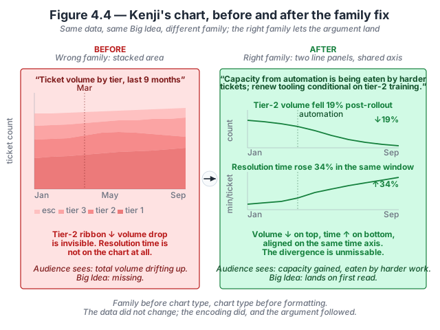
- The Big Idea determines the family. Kenji’s Big Idea is «tier-2 ticket volume dropped 19% post-automation, but mean resolution time per tier-2 ticket climbed 34%; the team that gained capacity from automation is being eaten by harder tickets.» That is a divergence between two trends. The right family is trend (two lines); the wrong family is composition (stacked area).
- Small multiples beat dual-axis for divergence claims. Two lines on one canvas with different y-axes force the reader to compare scales they cannot combine mentally; a dual-axis chart is where divergence claims go to become suspect. Small multiples give each series its own honest y-axis and let the shared x-axis carry the temporal comparison.
- Sort order encodes the boundary. Both panels have the automation month (March) marked as a reference line so the reader can see the pre/post windows without hunting for the boundary. The line change of slope after March is what the eye lands on.
- The stacked-area failure is not a chart-craft bug — it’s a family bug. No amount of colour, sort-order, or label polish on the stacked area would surface the argument, because the encoding chosen (part-of-whole area) is answering a different question shape than the one the Big Idea asks. Chapter 4 walks the discipline in The family-before-type discipline.
Inspect the numbers. Twelve monthly rows of tier-2 volume and mean resolution time (with pre/post window tags) are available as a flat CSV. Download kenji-ticket-tiers.csv · Dataset README and schema.
Try this activity — run the family-before-type pass on CloudRevenue
This activity walks the family-before-type discipline against five audience-questions on the CloudRevenue dataset. Total time: 30–45 minutes.
-
Read the five questions. Below are five audience-questions a services-revenue leader might reasonably ask against CloudRevenue. Before opening Power BI, name for each: (a) the chart family, (b) the canonical chart type, and (c) the likely Copilot default failure mode.
- Which product family had the highest Q3 revenue?
- What share of Q3 revenue came from each region?
- How has monthly services revenue trended over the last twelve months?
- Is there a relationship between customer tenure and expansion revenue?
- What is the distribution of contract sizes across our tenant base?
-
Write the five Crystallize directions. For each question, write one sentence that names the family, the canonical chart, and (if useful) one detail that forecloses the failure mode. Example for Q1: «Q3 revenue by product family as a Comparison — sorted horizontal bar chart, largest family at top; use a highlight palette to emphasise the top family.»
-
Run each Crystallize direction cold in Copilot. Type each sentence into the Copilot pane against the CloudRevenue dataset (or an equivalent from your own work). Accept the first output. Take a screenshot.
-
Now run each question without the Crystallize direction. For each of the five questions, type only the naked question («which product family had the highest Q3 revenue?»). Accept the first output. Take a screenshot.
-
Compare screenshots side-by-side. For each of the five questions, place the Crystallize-directed output next to the naked-question output. Note: (a) did the Crystallize direction foreclose the predicted failure mode? (b) how many of the naked-question outputs landed on the canonical chart type by accident? (c) which family’s default failure was most costly — how far off was the naked output from what the audience needed?
-
Reflect (three prompts). Write one sentence in response to each:
- Which family’s default failure mode was the most surprising to see reproduced by Copilot?
- Which of your Crystallize directions was too specific (over-directed the format) and which was under-specific (left the family ambiguous)?
- How much time would the Crystallize discipline save on the next report you build?
The reflection is the activity’s payoff. Skipping it turns the exercise into paperwork.
Optional extension: pick a chart your team shipped in the last month. Identify which family the audience-question fell in, and check whether the shipped chart used the canonical or the default-failure form. If the failure form, the Crystallize direction would have caught it.
Related site resources
- Chart Gallery: 48 chart types across 10 analytical-intent categories — the operational form of Ch 4’s taxonomy. Search by family (Comparison, Composition, Distribution, Relationship, Trend) to see canonical and cousin types side-by-side.
- CloudRevenue dataset: the dataset the activity above runs against. Ships with a SCHEMA.md that documents the deliberate imperfections you will run into.
- Chapter 3 companion: the previous chapter — writes the Big Idea and picks the framing that the family here maps to.
- Chapter 5 companion: the next chapter — once the family is right, focus and decluttering makes the chart argue the Big Idea instead of shouting equally at every element.
- Prompt Library: the seven canonical CSAR prompts from Appendix B. The Crystallize direction sits inside the broader Crystallize prompt pattern.
Cited in the book
Chapter 4’s bibliography lives in the book’s Appendix C (living version in errata). The chapter’s operative references:
- Kirk, A. (2024). Data Visualisation: A Handbook for Data Driven Design (3rd ed.). SAGE. The chart-purpose alignment framing the family taxonomy builds on.
- Few, S. (2012). Show Me the Numbers: Designing Tables and Graphs to Enlighten (2nd ed.). Analytics Press. The foundational chart-family taxonomy work the chapter compresses into the five-family teaching form.
- Cleveland, W. S., & McGill, R. (1985). «Graphical Perception.» Science, 229(4716), 828–833. The perceptual-accuracy ranking that justifies the canonical chart choices.