Companion to Chapter 12. Chapter 12 teaches the composition discipline that turns a Copilot-generated page from a report-shaped collection of visuals into a dashboard. Four load-bearing rules: the dashboard-vs-report distinction (instrument panel read in seconds, not document read in minutes); the 5-Visual Rule (an executive-summary page carries no more than five visuals); the hierarchy order (position, then size, then color, in that order); and the mobile obligation (pin a phone-specific layout that preserves the primary KPI as dominant). Two pre-ship gates — the blurred-thumbnail test and the mobile-preview check — catch composition failures before ship. This page carries what the book cannot: curated further reading beyond Appendix C on dashboard design, a five-question self-check quiz on the composition rules, and a hands-on activity that runs the full Refine pass against a Copilot dashboard.
Use the further reading to see the operational-vs-executive dashboard split at more depth (Wexler, Few). Use the quiz to move the four rules into vocabulary. Use the activity to feel the difference between a nine-visual Copilot default and a five-visual composed page.
Further reading
Books and articles beyond the book’s own bibliography (Appendix C, updated in errata) on dashboard composition and information hierarchy.
- Few, S. (2013). Information Dashboard Design: Displaying Data for At-a-Glance Monitoring (2nd ed.). Analytics Press. The foundational treatment. Few’s single-screen constraint, at-a-glance discipline, and dense operational-monitoring patterns are the direct source Ch 12 compresses. Chapters 3 («Common Pitfalls») and 5 («Fundamental Considerations of Effective Dashboard Design») pair directly with Ch 12’s Refine pass.
- Wexler, S., Shaffer, J., & Cotgreave, A. (2017). The Big Book of Dashboards. Wiley. The complement to Few — case studies of dashboards from real teams, with Why-This-Works commentary after each. The operational-vs-executive distinction Ch 12 uses is more richly illustrated here than anywhere else. Browse the case-study index for one that resembles your dashboard problem and read that chapter as reference material.
- Cotgreave, A. — The Big Book of Dashboards blog. Cotgreave (Tableau, Datawrapper) writes practitioner posts extending the book’s cases with current examples. Useful because dashboard tooling has moved considerably since 2017; the composition principles have not. Blog at bigbookofdashboards.com/blog.
- Kirk, A. (2024). Data Visualisation (3rd ed.). SAGE. Kirk’s page-composition chapters (7 and 8 in the 3rd edition) are the visual-design theory under Ch 12’s hierarchy-order rule. The composition-vs-content-distinction he draws is what Ch 12 operationalizes as position-size-color ordering. Same primary reference as Ch 1 and Ch 4; different chapters.
- Nielsen Norman Group — Visual Hierarchy in UX. A large body of practitioner writing on visual hierarchy from a UX-research perspective. The findings are transferable to dashboard composition — the same eye-tracking studies that inform web-page hierarchy apply to dashboard pages. Search at nngroup.com/articles/ for «visual hierarchy» and «F-pattern reading.»
Last curated: 2026-07-18. Reviewed quarterly. Suggestions welcome via the errata page.
Self-check quiz
Five questions on Ch 12’s load-bearing concepts. Answer them out loud before opening the reveal.
-
Q1. Ch 12 defines the dashboard-vs-report distinction by audience, decision, and dwell time. State the distinction in one sentence.
Show answer
A dashboard is an instrument panel read in seconds by an executive who needs the primary KPI to jump off the page; a report is a document read in minutes by a working analyst who needs the argument to build in sequence. Confusing the two ships a page that fails both audiences — a report-shaped dashboard leaves the executive hunting for the takeaway; a dashboard-shaped report leaves the analyst without the depth to defend it. The Chapter’s 5-Visual Rule and hierarchy-order rules are what enforce the dashboard side of the distinction.
-
Q2. What is the 5-Visual Rule, and what specifically does «more than five» signal?
Show answer
The operational default that an executive-summary dashboard page carries no more than five visuals. More than five signals a composition problem, not a data problem — the page is trying to be a report. The fix is not to squeeze the five extra visuals smaller; the fix is to name which two would be the first to remove and either move them off the page entirely or into a linked drill-down. The rule is a default, not a law — operational-monitoring dashboards routinely need more density; the fix in that case is a different visual grammar, not more visuals on the executive page.
-
Q3. Ch 12 names the hierarchy order: position, then size, then color. Why in that specific order?
Show answer
Position (where the eye lands first) is the strongest hierarchy signal — primary KPI top-left or top-center; every reader in every reading language pauses there before scanning elsewhere. Size is the second-strongest — a visibly larger visual pulls the eye even from a stronger position. Color is the third — an accent color used once directs the eye but only if position and size have not already claimed it. Skipping the order (color without size) produces a page where every visual shouts equally and the eye has nowhere to land. The order matches how pre-attentive attention works (Ch 5’s pre-attentive-attribute rule scaled up from single-chart to full-dashboard).
-
Q4. Ch 12 introduces the blurred-thumbnail test. What is it, and what specific failure does it catch?
Show answer
Take a screenshot of the dashboard, apply a mild blur (any image editor), and look at it. A well-composed dashboard shows: (a) a visibly dominant primary visual, (b) a supporting cluster of smaller visuals, (c) visible white space. A failed composition reads as uniform noise — every visual has similar visual weight, nothing dominates, no rest space. The test catches composition failures the analyst cannot see when reading the dashboard sharp (the eye compensates for a weak hierarchy by hunting). Blurred, the eye stops hunting and the failure becomes visible.
-
Q5. Ch 12 calls the mobile layout a mobile obligation rather than a nice-to-have. Why does mobile need its own pinned layout instead of relying on the default responsive reflow?
Show answer
Power BI’s default responsive reflow stacks all visuals equal-sized in a vertical scroll and flattens the desktop’s composed hierarchy. The primary KPI that dominated at desktop becomes one of five equal-height cards on the phone — the composition dies. If the executive reads the dashboard on their phone (they do — commuting, in transit between meetings, before the standup), the mobile layout is where the dashboard lives most of the time. Pinning a phone-specific layout that preserves the primary KPI as visibly dominant is the discipline that stops the mobile view from unwinding the desktop composition.
Rohan’s services-revenue dashboard, up close
Rohan’s scenario in Chapter 12 is a Monday-morning executive dashboard: fiscal Q3 landed at $18.75M against a $19.20M plan, a -2.3% miss that recovered to pace in September. Every number reconciles — three monthly totals sum to the Q3 quarter total, four service lines sum to the Q3 total, four regions sum to the Q3 total, monthly plan sums to the Q3 plan — so the defects Chapter 12 diagnoses are pure composition failures, not arithmetic mistakes. The four Refine checks (5-Visual Rule, hierarchy, composition, mobile) turn the nine-visual Copilot first draft into the five-visual page that passes the thirty-second test.
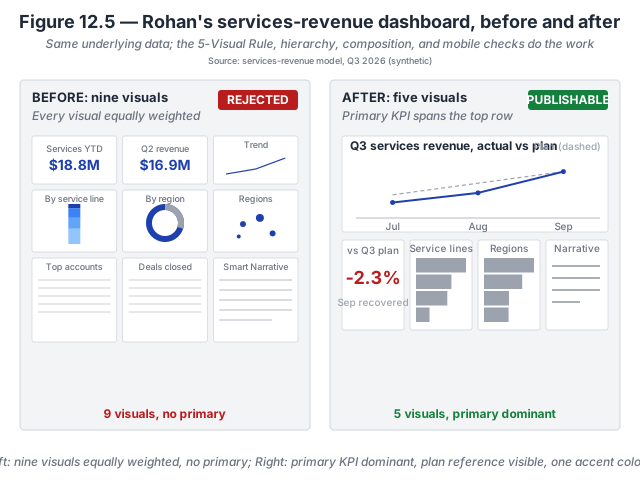
- 5-Visual Rule — cut nine visuals to five. Six of the nine visuals on the Copilot first draft either duplicated the primary KPI (the two YTD cards were already visible on the trend chart) or answered a different question than the audience’s (the deals-closed table, the top-accounts table). Rohan named the primary KPI as revenue trend with plan reference and cut the six visuals that did not support it, then added the variance-to-plan card the trend chart alone could not compress into a headline.
- Hierarchy — position, size, colour in that order. The primary KPI takes the entire top row (position + size); the four supporting visuals share the bottom row at equal smaller sizes. The brand accent appears exactly once, on the plan reference line, so the eye lands there first. Copilot’s default put every KPI in an equally-styled card and used the brand accent on all nine visuals; the composition read flat as a result.
- Composition — snap-to-grid + one accent. All five visuals in the AFTER dashboard align to the grid and share consistent internal padding. The muted-gray palette on the supporting visuals lets the primary KPI carry the visual weight. This is Ch 6’s highlight-palette pattern applied at the page level rather than at the chart level.
- Mobile — pin a phone layout, don’t trust the reflow. Copilot’s default reflow stacks all five visuals at equal width on mobile, flattening the hierarchy the desktop version establishes. Rohan pinned a mobile layout with the primary KPI still visibly dominant at the top and the other visuals accessible by tap. The phone version passes the thirty-second test the same way the desktop version does.
The underlying data did not change. What changed was Rohan’s attention to which visual the audience is meant to read first, and how much visual weight each subsequent tile should carry. The next Monday, the executive read the dashboard in the thirty seconds the meeting allowed and asked one question about a specific service line’s variance — which Rohan answered from the supporting bar. The dashboard worked as an instrument.
Inspect the numbers. The full aggregate dataset is available as a flat CSV so you can rebuild the two dashboards yourself. Download rohan-services-dashboard.csv · Dataset README and schema.
Try this activity — run the full composition Refine on a Copilot dashboard
This activity walks the four Ch 12 checks against a Copilot-generated dashboard. Total time: 30–45 minutes; requires Power BI + Copilot-ready capacity.
-
Generate the dashboard cold. In Power BI Copilot against the CloudRevenue dataset, prompt: «Build an executive dashboard for the services-revenue leader with the takeaway on whether we hit Q3 plan.» Accept the first output. Screenshot the page.
-
Run the 5-Visual Rule check. Count the visuals on the page. If above five, name which two would be the first to remove and write the one-sentence rationale per removal. Draft the Refine direction that would remove them and promote a specific one to primary KPI.
-
Run the hierarchy-order check. Identify the visual that answers the audience’s central decision question. Is it (a) top-left or top-center (position), (b) visibly larger than the supporting visuals (size), (c) the only visual carrying the brand accent color (color)? If any of the three is missing, draft the Refine direction that fixes it.
-
Run the blurred-thumbnail test. Take a screenshot; apply a mild blur (Photoshop / GIMP Gaussian blur ~5–10px, or any online blur tool). Look at the blurred image. Does it show a clear primary, a supporting cluster, and visible white space? If not, note which of the three is missing.
-
Run the mobile-preview check. Open the mobile preview (View menu → Mobile Layout). Look at the default reflow. Is the primary KPI visibly dominant, or has it been flattened into a stack of equal-size cards? Pin a phone-specific layout that reinstates the primary KPI’s dominance — usually by placing it full-width at the top with the supporting visuals below at half-width.
-
Apply all Refine directions and re-audit. Combine the Refine directions from steps 2–4 into one paragraph. Run them against Copilot (or apply by hand). Re-run the blurred-thumbnail test on the revised dashboard. It should now pass. If not, the revision did not go far enough — iterate.
-
Reflect (three prompts). Write one sentence in response to each:
- Which of the four checks caught the biggest composition failure in the Copilot default?
- How many visuals did you end with, and what tradeoffs did the removals force?
- What Refine-direction phrasing produced the most reliable Copilot response — naming what to remove, or naming what to keep?
The reflection is the activity’s payoff. Skipping it turns the exercise into paperwork.
Optional extension: run the blurred-thumbnail test on a dashboard your team currently ships. Dashboards that look fine sharp but fail blurred are a common source of the «why doesn’t the executive engage with our dashboard?» question.
Related site resources
- Rohan’s services dashboard dataset: the synthetic Q3 rollup behind the two dashboards on this page — monthly actual and plan, four service lines, four regions, one Q2 baseline.
- Chapter 12 — Practice-on-your-own solutions: worked answers to the operational-monitoring exception and the blurred-thumbnail-failure problems.
- CloudRevenue dataset: the dataset the activity above runs against.
- Chart Gallery: browse the gallery’s dashboard-composition entries for examples of composed pages that pass the blurred-thumbnail test.
- Chapter 11 companion: the previous chapter — Prep for AI applies at the semantic-model layer; dashboard composition applies at the report layer; the two disciplines compose.
- Chapter 13 companion: the next chapter — failure modes and how to catch them; over-styled output is the dashboard-composition failure Ch 12 exists to prevent.
- Prompt Library: includes a dashboard-composition Refine template that names all four Ch 12 checks in one direction.
Cited in the book
Chapter 12’s bibliography lives in the book’s Appendix C (living version in errata). The chapter’s operative references:
- Few, S. (2013). Information Dashboard Design (2nd ed.). Analytics Press. Foundational composition and hierarchy discipline.
- Wexler, S., Shaffer, J., & Cotgreave, A. (2017). The Big Book of Dashboards. Wiley. Operational-vs-executive dashboard distinction and case-study patterns.
- Kirk, A. (2024). Data Visualisation (3rd ed.). SAGE. Hierarchy-order framing (position → size → color).