Companion to Chapter 6. Chapter 6 teaches three color jobs (unordered categories, ordered magnitude, meaningful zero point), the three palette types that match them (categorical, sequential, diverging), and the discipline of catching silent accessibility failures — the Copilot defaults that look fine to the analyst but collapse under a color-vision-deficiency simulator or grayscale print. Paired with the pre-attentive-attribute rule from Ch 5, the chapter closes the Part I visual-craft arc: a chart that has the right family (Ch 4), stripped clutter (Ch 5), and survives the color-and-type audit (Ch 6) is defensible against principle-check. This page carries what the book cannot: curated further reading beyond Appendix C on color science and typography, a five-question self-check quiz on the palette-and-hierarchy discipline, and a hands-on activity that runs the accessibility audit against a Copilot dashboard.
Use the further reading to see the perceptual basis of the palette choices and the WCAG standards the accessibility check operationalizes. Use the quiz to check whether the three palette-types-and-jobs mapping has moved into reflex. Use the activity to feel the moment a Copilot chart that looked fine turns unreadable under the simulator.
Further reading
Books, articles, and tools beyond the book’s own bibliography (Appendix C, updated in errata) on color perception, accessibility standards, and typography for data displays.
- Brewer, C. A. — ColorBrewer. The canonical practitioner tool for choosing sequential, diverging, and categorical palettes with built-in color-vision-deficiency and print-safety checks. Brewer (Penn State cartographer) built it from her academic work on map color; the palettes are used in QGIS, matplotlib, D3, and most modern viz tools. Free at colorbrewer2.org — select the palette-type-and-count from the interface, get RGB / HEX / CMYK values ready to paste into your tool.
- Ware, C. (2020). Information Visualization: Perception for Design (4th ed.). Morgan Kaufmann. The perceptual-science textbook underneath every color-and-attention decision in Ch 6. Chapters 4 («Color») and 5 («Visual Salience») are the direct pairing. Long but organised by problem so you can read the sections that apply.
- W3C — WCAG 2.1 Contrast Guidelines. The web-standard contrast ratios (4.5:1 for normal text, 3:1 for large text and graphical objects) that the «silent accessibility failure» check operationalizes. The book quietly assumes these ratios; running a chart through a WCAG contrast checker is a defensible bright-line test. Overview at w3.org/WAI/WCAG21/Understanding/contrast-minimum; contrast calculators linked from that page.
- Coblis — Color Blindness Simulator. The web-based simulator the chapter refers to. Upload a chart screenshot, view it under deuteranopia, protanopia, tritanopia, and full monochromacy. Free, no account. Runs at color-blindness.com/coblis-color-blindness-simulator. Desktop alternative: ColorOracle at colororacle.org.
- Bringhurst, R. (2013). The Elements of Typographic Style (4th ed.). Hartley & Marks. The canonical treatment of typography as a design system — the intellectual scaffolding under Ch 6’s four-level typographic hierarchy. Overkill if you just want the working rules; essential if you want to understand why the axis-label / data-label / source-note ratios matter beyond aesthetics. Read chapters 2 and 3 for the hierarchy discipline.
Last curated: 2026-07-18. Reviewed quarterly. Suggestions welcome via the errata page.
Self-check quiz
Five questions on Ch 6’s load-bearing concepts. Answer them out loud before opening the reveal.
-
Q1. Name the three palette types and the color job each is designed for.
Show answer
Categorical — unordered categories (regions, product families, teams). Small set of perceptually distinct hues. Sequential — ordered values along a single dimension (revenue, count, magnitude). Single hue at varying lightness or saturation. Diverging — ordered values with a meaningful midpoint (variance to plan, year-over-year change, sentiment). Two complementary hues meeting in a neutral middle. Getting the palette-type-to-job mapping wrong is the most common accidental failure in Copilot output.
-
Q2. The chapter names two «default failure modes» where a palette type is applied to the wrong color job. State one, and describe what the reader sees.
Show answer
Failure 1: categorical palette applied to ordered data. Regions in rainbow colors on a magnitude-encoding chart — the reader has to look at the legend to know which color means «more,» because the palette does not encode the order. Failure 2: diverging palette applied to a one-directional metric with no midpoint. Red-to-green on a metric where zero has no meaning (e.g., total revenue) — the reader imports the midpoint’s semantic weight («bad» on one end, «good» on the other) onto a scale that has no such structure.
-
Q3. The chapter names the pre-ship check for the «silent accessibility failure.» What is the check, what specific tools does it use, and what does it catch that the analyst cannot see by inspection?
Show answer
The color-vision-deficiency (CVD) simulation check, using Coblis or ColorOracle to render the chart under deuteranopia, protanopia, and tritanopia. It catches encodings that fail without color — a categorical palette where two categories become indistinguishable under a common form of color-blindness; a red-vs-green diverging palette that both read as beige under deuteranopia; a heatmap that flattens to uniform gray under monochromacy. The failure is silent because inspection does not catch it; only running the simulator does. Roughly 8% of male readers have red-green CVD; the check is not optional for anything shipped externally.
-
Q4. The chapter’s fix for silent accessibility failures is not «pick different colors» but a different technique. What is it, and give one example of how it manifests?
Show answer
Redundant encoding. Add shape, line style, direct labels, or pattern alongside color so meaning survives when color fails. Example: a line chart with three series encoded by hue plus by line-style (solid / dashed / dotted). When color fails (grayscale print, CVD, poor projector), the line-styles carry the identification. Another example: a categorical bar chart with the load-bearing category directly labeled in place, so the reader does not have to consult the legend under any color condition.
-
Q5. Ch 6 names a four-level typographic hierarchy. List the levels, top to bottom, and name the approximate size relationship between adjacent levels.
Show answer
Title — axis labels — data labels and annotations — source notes. The title is at least twice the axis-label size; the axis-label is at least twice the source-note size. The point of the hierarchy is that the reader can locate content at a glance without reading everything — the title lands first (Big Idea), the axis labels give the frame, the data labels answer the specifics, the source notes support any deeper interrogation. Flatten the hierarchy (all levels similar size) and the reader has to read everything to find anything.
Aisha’s AIRS-cohort chart, up close
Aisha’s scenario in Chapter 6 is a doctoral figure her advisor rejected: a chart of AIRS-readiness gains across six cohorts of an AI-and-analytics course, drawn with her university’s single-hue brand palette. Every number reconciles — six cohorts, one row per cohort, all gains positive, Cohort 6 (Spring 2026) roughly 2.2× the gain of Cohort 1 (Fall 2023) — so the visual defects are decisions, not arithmetic mistakes. The four interventions Chapter 6 walks through (palette-type correction, redundant encoding for accessibility, four-level typographic hierarchy, pre-attentive weighting) turn the rejected figure into the publishable version below.
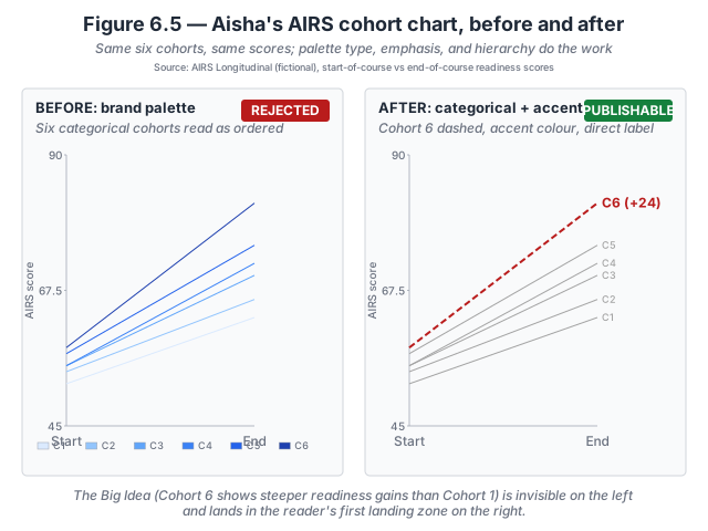
- Palette type — sequential-looking brand becomes categorical. The university brand palette is a single-hue blue ramp; used for six unordered cohorts it reads as ordered by darkness. Aisha switches to a categorical treatment: muted gray for Cohorts 1–5 (they are context, not the argument) and a strong accent for Cohort 6.
- Accessibility — redundant encoding for the accent line. Under deuteranopia simulation, a Set2 teal for Cohort 6 collapses toward a Set2 blue used for Cohort 3. Aisha adds two carriers so meaning survives colour failure: Cohort 6 becomes a 2pt dashed line, and every cohort gets a direct end-of-line label. The dashed line survives grayscale print and every form of colour-vision deficiency.
- Typographic hierarchy — four visible levels. The advisor’s cold-read was slowed by axis labels that competed with the title. Aisha resets title at 14pt bold, axis at 10pt, data at 9pt, source note at 8pt gray — a four-level ratio the reviewer’s eye reads in one landing.
- Pre-attentive weighting — the argument gets the emphasis. Cohorts 1–5 render at 1pt in muted gray; Cohort 6 renders at 2pt in the accent colour with the +24 gain in bold. The Big Idea («the most recent cohort shows steeper readiness gains») lands in the reader’s first landing zone in under a second.
The underlying data did not change. What changed was the analyst’s attention to the audiences and venues the chart had to serve. Aisha’s figure works in the journal PDF, on a grayscale printer, and for the ~8% of male reviewers with red-green colour-vision deficiency — conditions her original figure quietly failed on.
Inspect the numbers. The full six-cohort dataset is available as a flat CSV so you can rebuild the slope graph yourself in any tool that reads five columns. Download aisha-airs-cohorts.csv · Dataset README and schema.
Try this activity — run the accessibility audit on a Copilot dashboard
This activity walks the color-and-type audit against a Copilot-generated dashboard. Total time: 25–35 minutes.
-
Generate the dashboard. In Power BI Copilot against any teaching dataset, prompt: «build me an executive dashboard with revenue by region, revenue trend over the last twelve months, and variance to Q3 plan.» Accept the first output. Screenshot the dashboard.
-
Run the palette-type audit. For each visual on the dashboard, identify (a) the color job (unordered categories, ordered magnitude, meaningful midpoint), (b) the palette type Copilot used, and (c) whether the two match. Note any mismatch — a categorical palette on an ordered dimension is the most common Copilot failure; a diverging palette on a no-midpoint metric is next.
-
Run the CVD simulation. Upload the screenshot to Coblis. Render under deuteranopia and protanopia. Note any visual where two categories become indistinguishable, or where a diverging palette collapses to a single tone. These are the silent accessibility failures.
-
Run the grayscale check. Convert the screenshot to grayscale (any image editor, or set the display to monochrome). Note any visual where the color-encoded distinction disappears entirely. If the chart cannot be read in grayscale, it will not survive a black-and-white print or a monochrome projector.
-
Run the typographic-hierarchy check. For the primary chart, measure the title-to-axis-label ratio and the axis-label-to-source-note ratio. Are they at least 2:1? If the title is not visibly dominant, the audience will hunt for the Big Idea instead of reading it first.
-
Compose the Refine direction. Write a one-paragraph Refine direction to Copilot that fixes each surfaced issue: name the correct palette type per visual, add redundant encoding (shape / line-style / direct labels) where CVD or grayscale broke, and specify the typographic hierarchy in explicit font-size ratios. Apply the Refine direction and re-audit.
-
Reflect (three prompts). Write one sentence in response to each:
- Which visual’s palette-type mismatch was the biggest gap between authored intent and audience experience?
- Under CVD simulation, did any visual become unreadable? Which one, and why?
- How would you standardise the CVD-and-grayscale check as a pre-ship gate on your team’s workflow?
The reflection is the activity’s payoff. Skipping it turns the exercise into paperwork.
Optional extension: run the same audit on your team’s dashboard style guide (if one exists). Style guides often set brand colors without checking them against CVD or grayscale — the audit will surface which brand palette choices are load-bearing versus which are silently failing.
Related site resources
- Aisha’s AIRS cohorts dataset: the synthetic six-cohort scenario behind Aisha’s chart — start-of-course and end-of-course AIRS scores as a flat CSV.
- Chapter 6 — Practice-on-your-own solutions: worked answers to the two problems in the print book’s Practice section.
- Chart Gallery: gallery entries include palette-type annotations; use it to see how sequential and diverging palettes actually render on canonical chart types.
- Datasets: any teaching dataset works for the activity above; CloudRevenue and M365Marketing both have the multi-dimension shape the audit needs.
- Chapter 5 companion: the previous chapter — strip clutter first, then audit color; the two disciplines compose but the sequence matters.
- Chapter 7 companion: the next chapter — the hinge from hand-built to AI-directed; the readiness gate includes a «can you defend your color choices against WCAG?» check.
- Prompt Library: the CSAR prompts include Refine-direction templates for palette and typography corrections.
Cited in the book
Chapter 6’s bibliography lives in the book’s Appendix C (living version in errata). The chapter’s operative references:
- Cleveland, W. S., & McGill, R. (1985). «Graphical Perception.» Science, 229(4716), 828–833. The perceptual-accuracy ranking that puts color saturation at the bottom — the empirical basis for why redundant encoding matters.
- Munzner, T. (2014). Visualization Analysis and Design. CRC Press. Chapter 10 («Map Color and Other Channels») is the direct academic pairing for the three-palette-type taxonomy.